

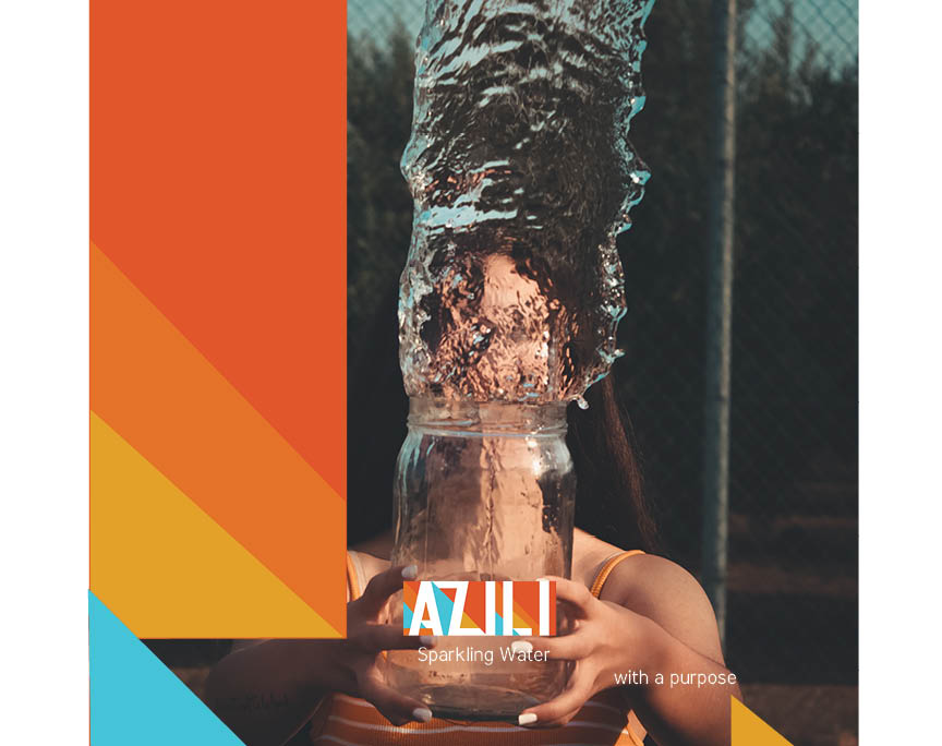
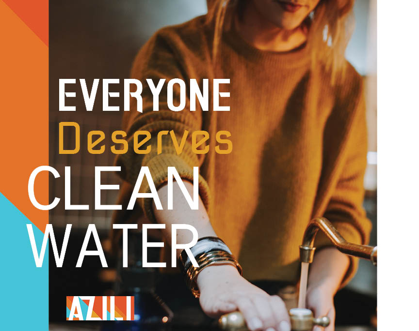
Azili is water with a purpose. It seeks to provide relief efforts and be on the ground in areas where clean water is not available. Every can purchased insures that fresh water gets to those in need.
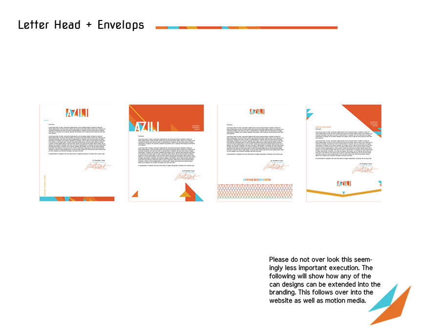
The Following is the brand development for this company. We began with the logo, then moved onto initial brand guidelines, can design and stationary package design, can design and finally package design. This was completed in one month. I also updated their website.
End Up At The Start
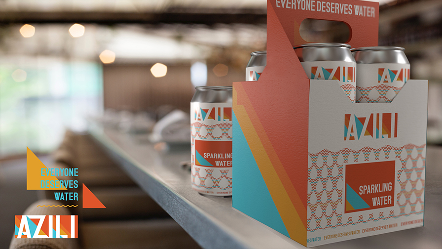
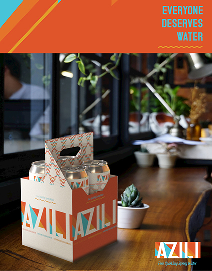
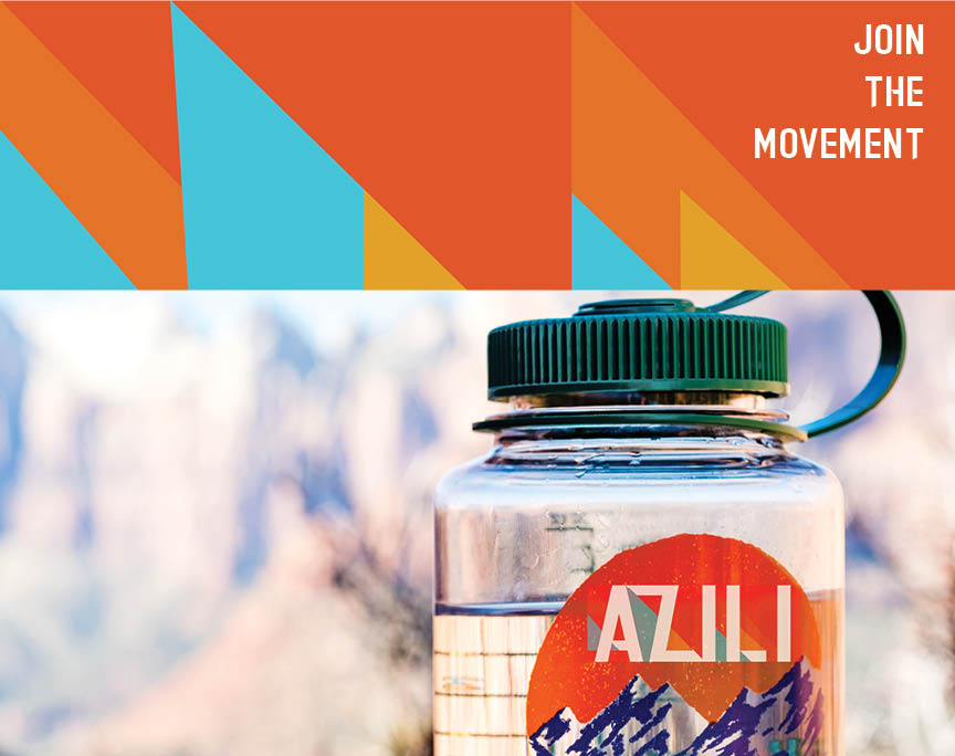
This is where we ended up at with the final four pack of the cans. This is a 3D render I created to help them visualize the packaging before it was produced. Other examples of the package design can be seen below.
“This four can carrier mimics the can design on the front while utilizing a striking side panel that transitions into the handle. Strong visibility on the sides with a clean front.”
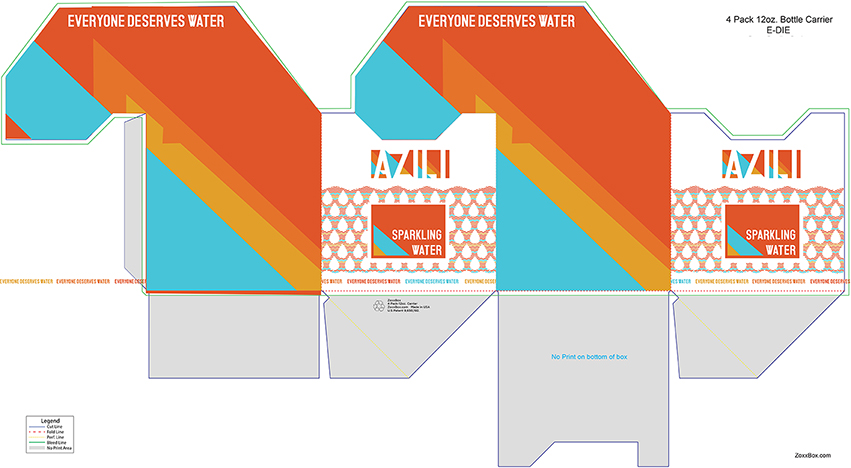

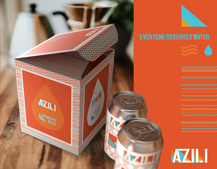

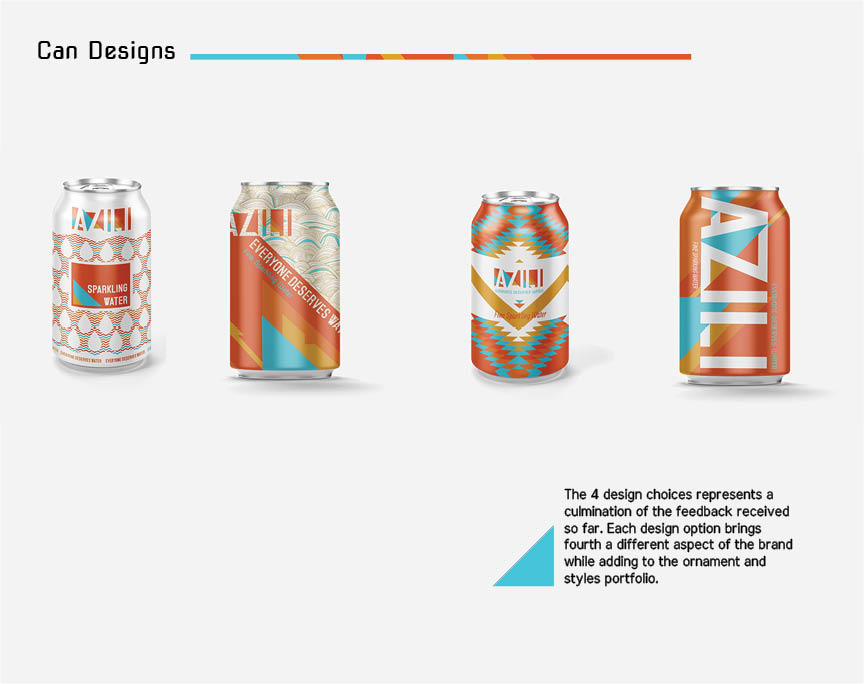
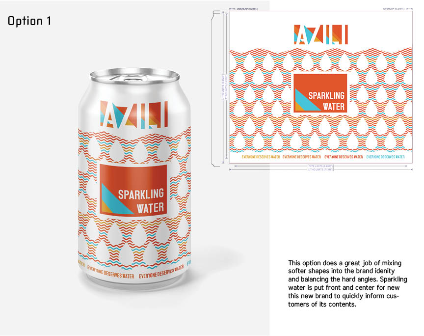
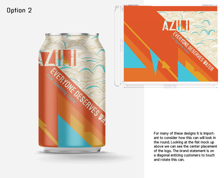
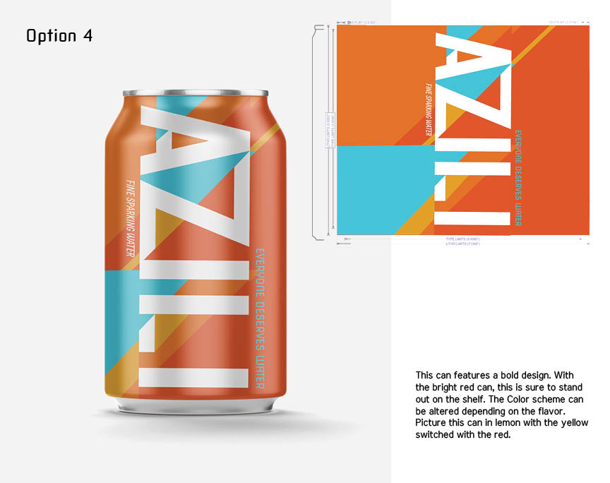
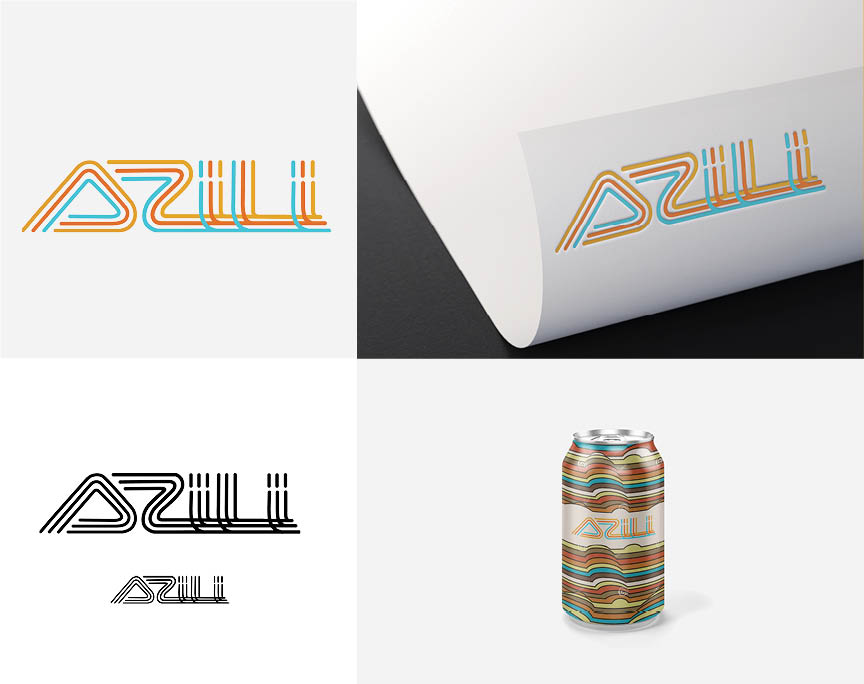
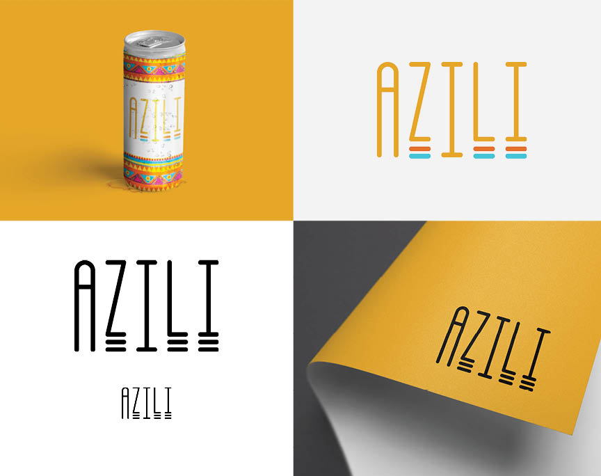
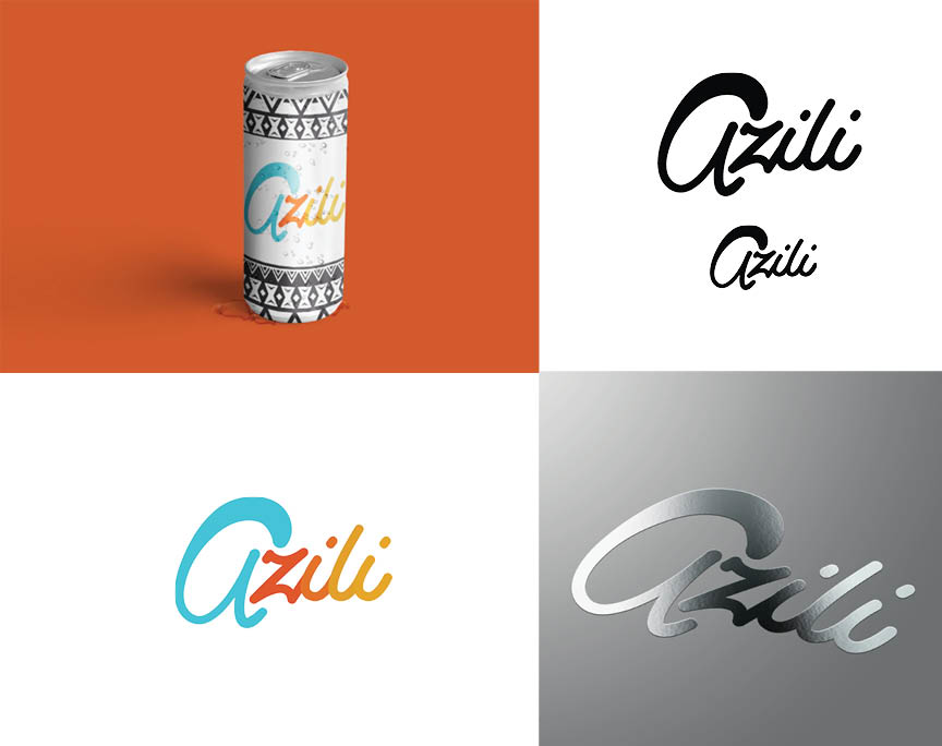
Alternative Package Designs

Target Market
Azili is a brand that seeks to make the entry point to giving and making good choices easy and accessible for everyone. They are targeting a young adult audience who cares about how companies spend their money and who want to do some good in the world. This brand bridges that gap by making a product purchase a charity donation.

The Idea
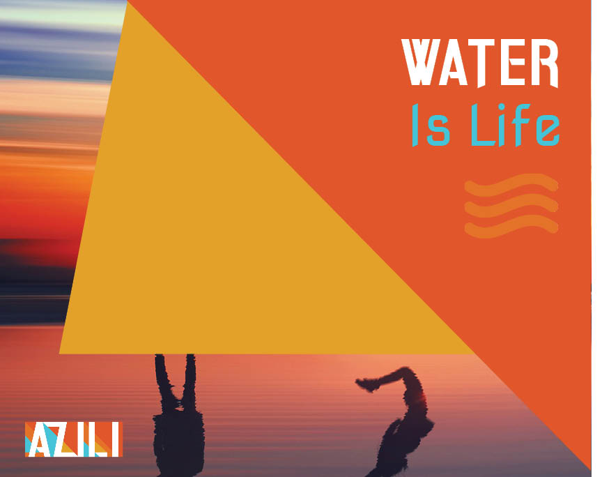
The brand needed to feel fresh and clean while also being warm and welcoming. The colors and imagery needs to find the balance between caring for a cause and inspiring change. South Western and Southern California colors and patterns were used to invoke the connection to nature and this regions laid back approach to living a good life.

Outcomes
We created a brand identity that stands out on a shelf. The message is clear in all touch points “Everyone Deserves Water.” As Azili continues to grow it’s color scheme and presence will serve as a beacon for other companies to follow. By championing giving and caring at the core of their identity, Azili is positioned to spread rapidly through social media and a loyal consumer base who also wants to do some good.


Branding Guidelines
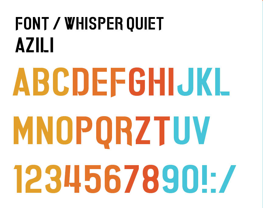
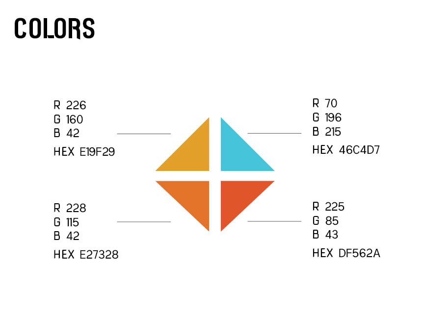
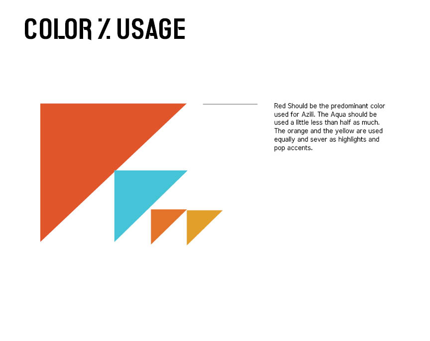
These initial branding guidelines were developed after the logo was chosen. This is a broad attempt to establish rules that will used moving forward. At this stage things are still very much influx. As new executions are established and options given new paths to the brand identity will emerge. I think it’s important to deliver this type of system early on to the client to help them understand the method being used as we move forward.


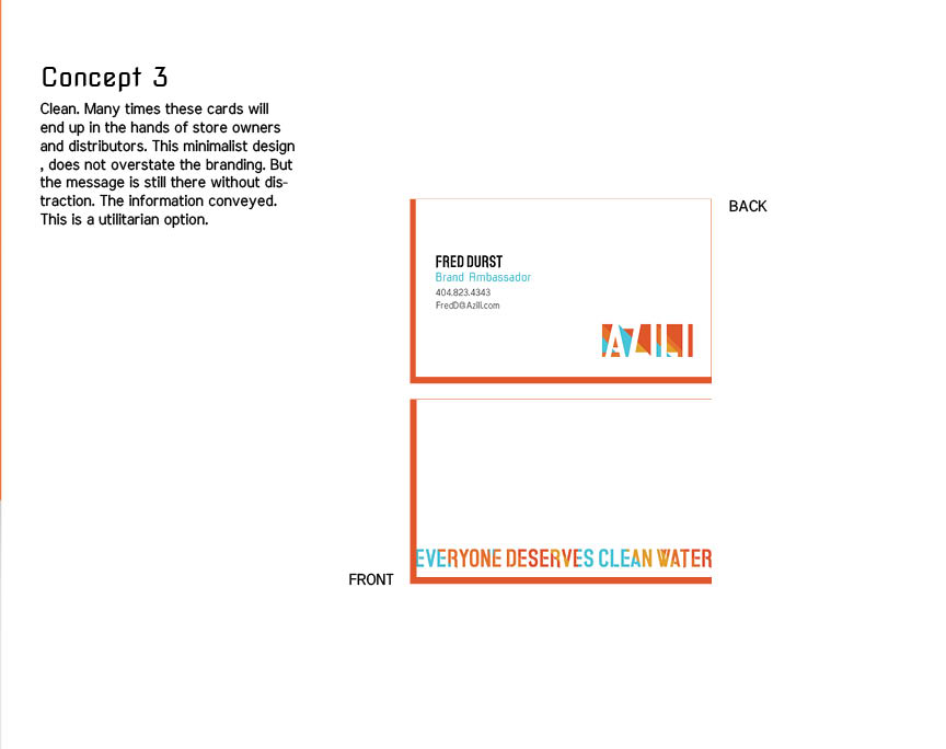
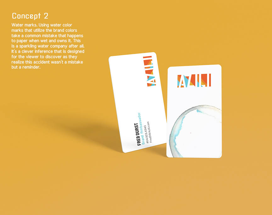
Business Cards
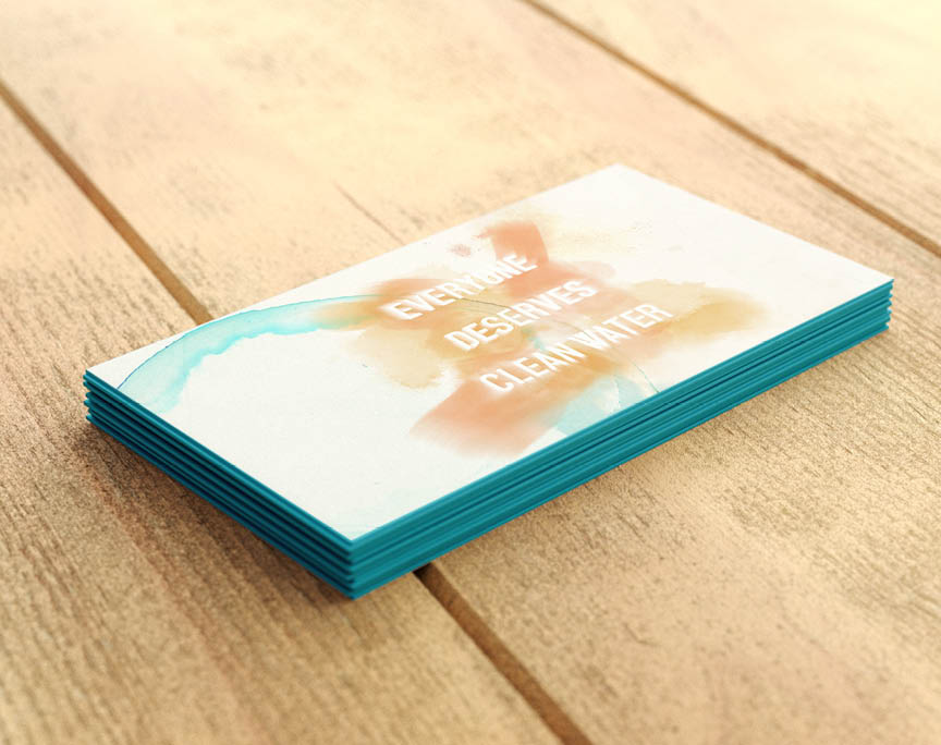
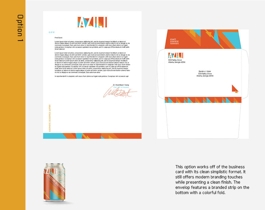
This simple brand statement was produced next. It gives a small step to begin exploring the brands logo and font usage while adding minimal additions to the brand identity. The client chose the clean and minimalist card. My personal favorite is the colorful water stained card below.